On this page, you’ll find sample visualizations that relate to the Viral Texts project. Most of these have been created for particular project publications.
Newspaper Data
The newspapers published each year in the United States during the nineteenth century, derived from the Library of Congress’ US Newspaper Directory and prepared as part of our forthcoming book, Going the Rounds. You can also open this graph in its own window.
Network Graphs
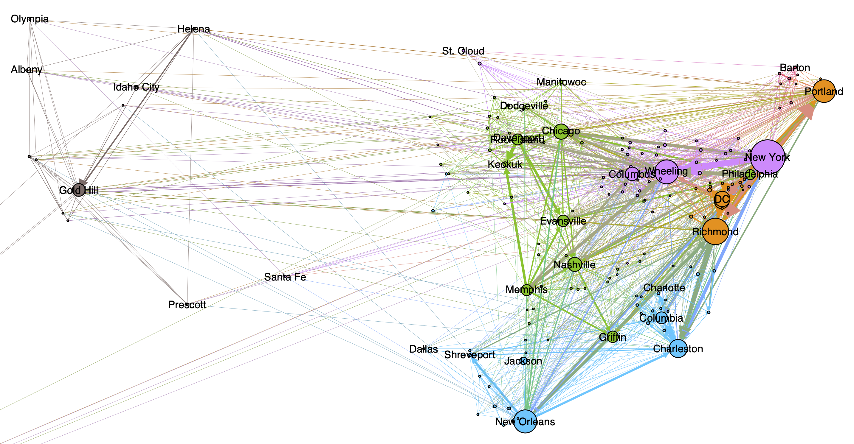
This graph, prepared as part of a book chapter in progress, uses the concept of “information cascades” to visualize how information circulated geographically through the US in the nineteenth century.
Network graphs created for our article, “Reprinting, Circulation, and the Network Author in Antebellum Newspapers.” can also be found in these directories.
Genre Classification
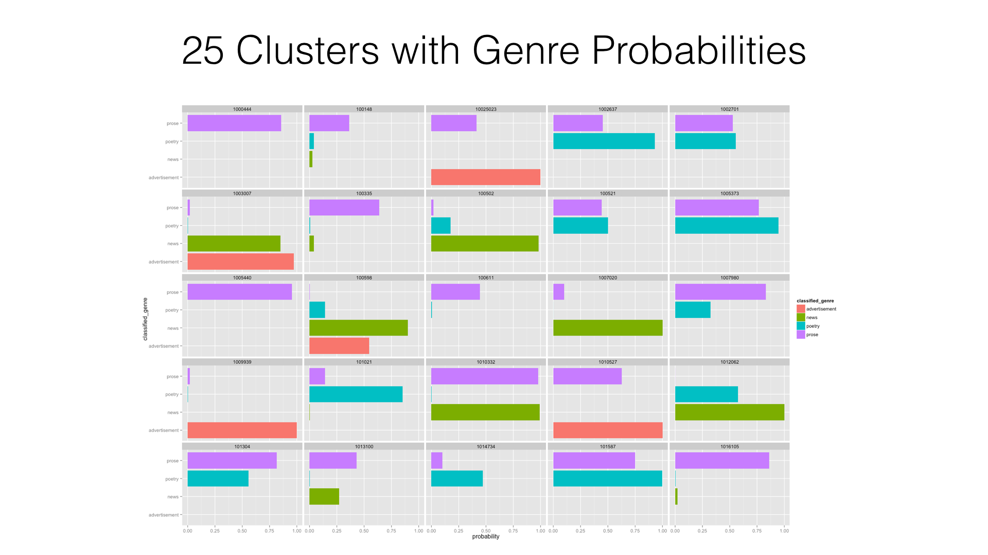
This graph shows the probabilities of newspaper texts belonging to four genres, as described in our book chapter, “Classifying Vignettes, Modeling Hybridity.”
Reprinting Data
The authors from the Wright American Fiction Collection most reprinted in newspapers, and prepared as part of our forthcoming book chapter, “Reprinting Wright.”. You can also open this graph in its own window.
Geographic Visualizations
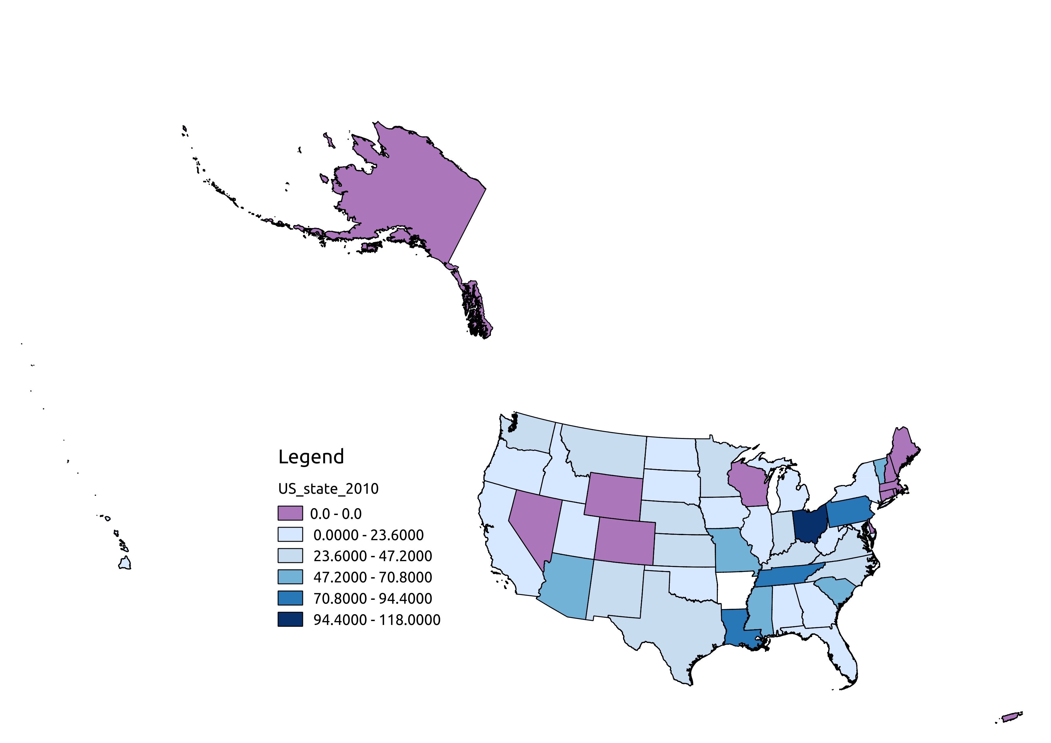
This map shows the number of newspapers each state has contributed to Chronicling America, prepared while writing “‘Q i-jtb the Raven’: Taking Dirty OCR Seriously”.